📊 Canvas 制作PPT最佳实践指南
1 📝 版本记录
| 版本号 | 修改人 | 更新说明 |
|---|---|---|
| v1.0 | 左手用AI | 文档初始化 |
| v1.1 | 左手用AI | 增加十种风格,示例图片待补充 |
2 📋 概述
本文档旨在为用户提供一份关于使用 Google Gemini Canvas 高效制作专业级 PPT 的全方位实战指南。文档内容汇总了多平台专家的实战经验,涵盖了从基础操作到进阶技巧的完整学习路径。
文档核心内容包括:
- 🚀 基础与流程:Canvas 功能的启动、操作步骤及实时预览调整方法。
- 🎨 风格与提示词:详解 Bento Grid、极简主义、瑞士国际主义等 6 种主流设计风格的 Prompt 模板。
- 💡 实战技巧:收录来自 X、知乎、B站等平台的专家经验与避坑指南。
- 📚 场景模板:提供商业提案、教育培训、产品发布等高频场景的直接复用模板。
- ⚡ 效率与资源:效率提升策略、常见问题解答 (FAQ) 及精选设计资源推荐。
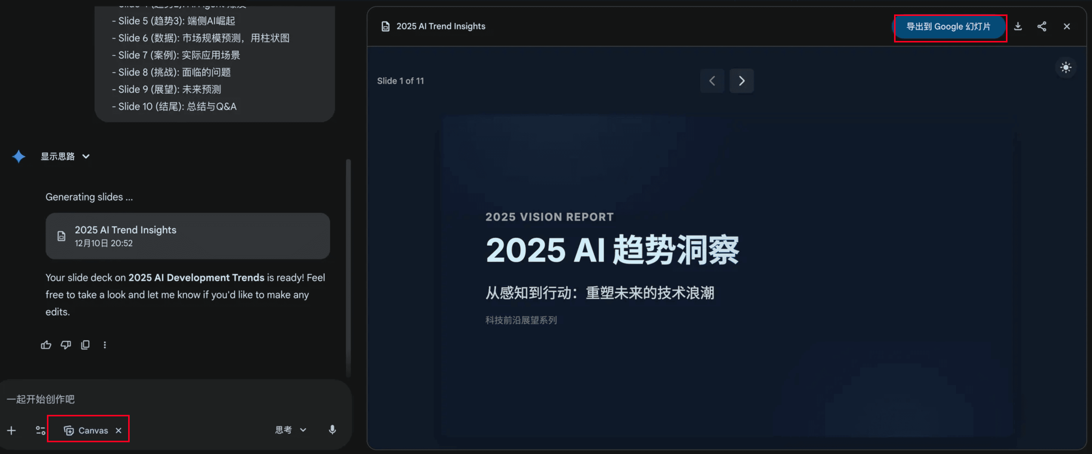
3 🚀 基础操作与流程
3.1 完整操作步骤
-
访问 Gemini 平台
- 登录 Google Gemini
- 确保使用支持 Canvas 功能的账户版本。
-
启动 Canvas 生成演示文稿
- 在工具栏中选择并打开 Canvas 模式。
- 关键触发词:
Create a presentation about...或制作一个关于...的演示文稿。 - 提示词建议:在首次输入时尽量包含主题、结构和风格要求(例如:“制作一个关于AI趋势的10页PPT,使用极简科技风格”)。
-
实时预览与交互调整
-
观察右侧 Canvas 区域动态生成的预览。
-
使用自然语言进行修改,例如:
- “将第三页背景改为深蓝色”
- “在第二页添加数据图表”
- “放大标题字体”
-
-
优化与完善
- 检查内容逻辑和完整性。
- 调整视觉层次和排版。
- 添加必要的数据可视化元素。
-
导出与分享
- 点击右上角的导出按钮。
- 选择格式(通常为 Google Slides 或 PowerPoint)。
- 建议:导出后在专业软件中进行最终的精细调整。
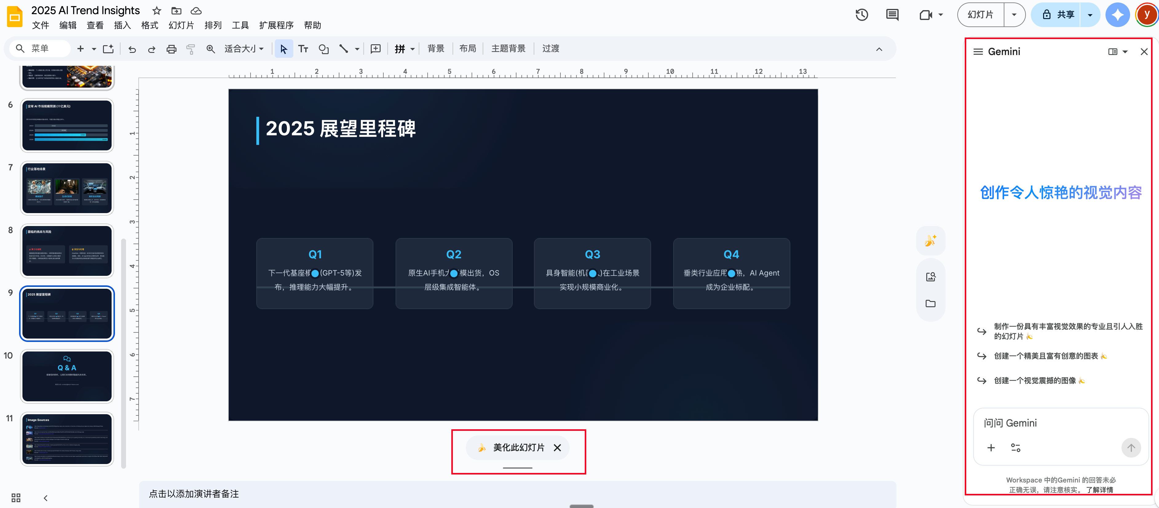
4 🔄 导出到Google Slides后的优化
生成的幻灯片可以点击右上方导出到Google Slides继续编辑,或者导出PPTX格式。
在Google Slides里,你可以:
- 使用🍌模型修改图片或重新美化幻灯片
- 右侧有Gemini可以继续修改
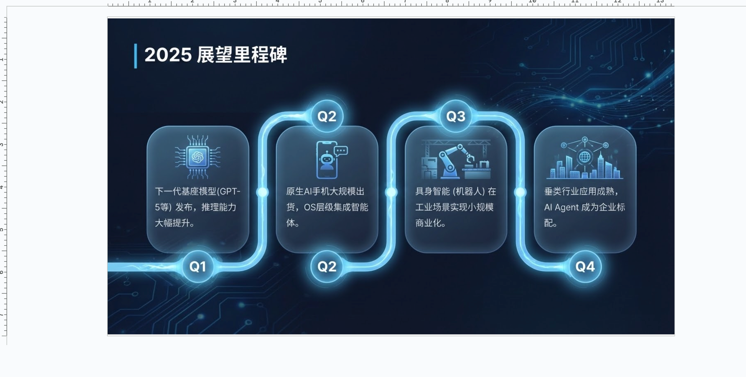
美化后的效果:
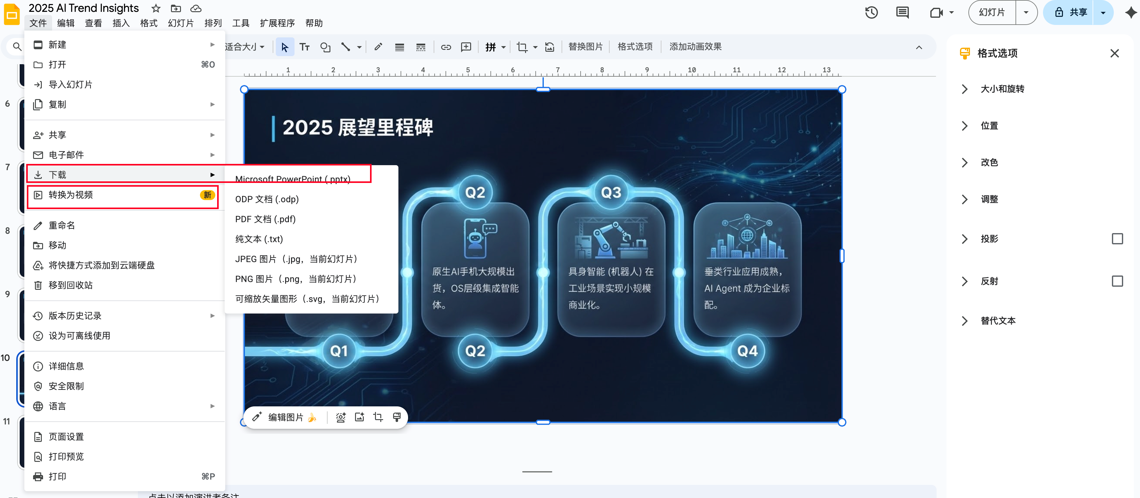
导出格式:右上角可以导出你想要的格式,包括PPTX、PDF,甚至可以转成视频。
5 🎨 Canvas风格提示词推荐
5.1 1️⃣ Bento Grid(便当盒布局)
风格特点:
- 📦 模块化卡片设计,信息分区明确
- 🎯 适合展示多个独立要点
- 💡 现代感强,视觉层次清晰
- 🔲 网格系统,整齐有序
提示词示例:
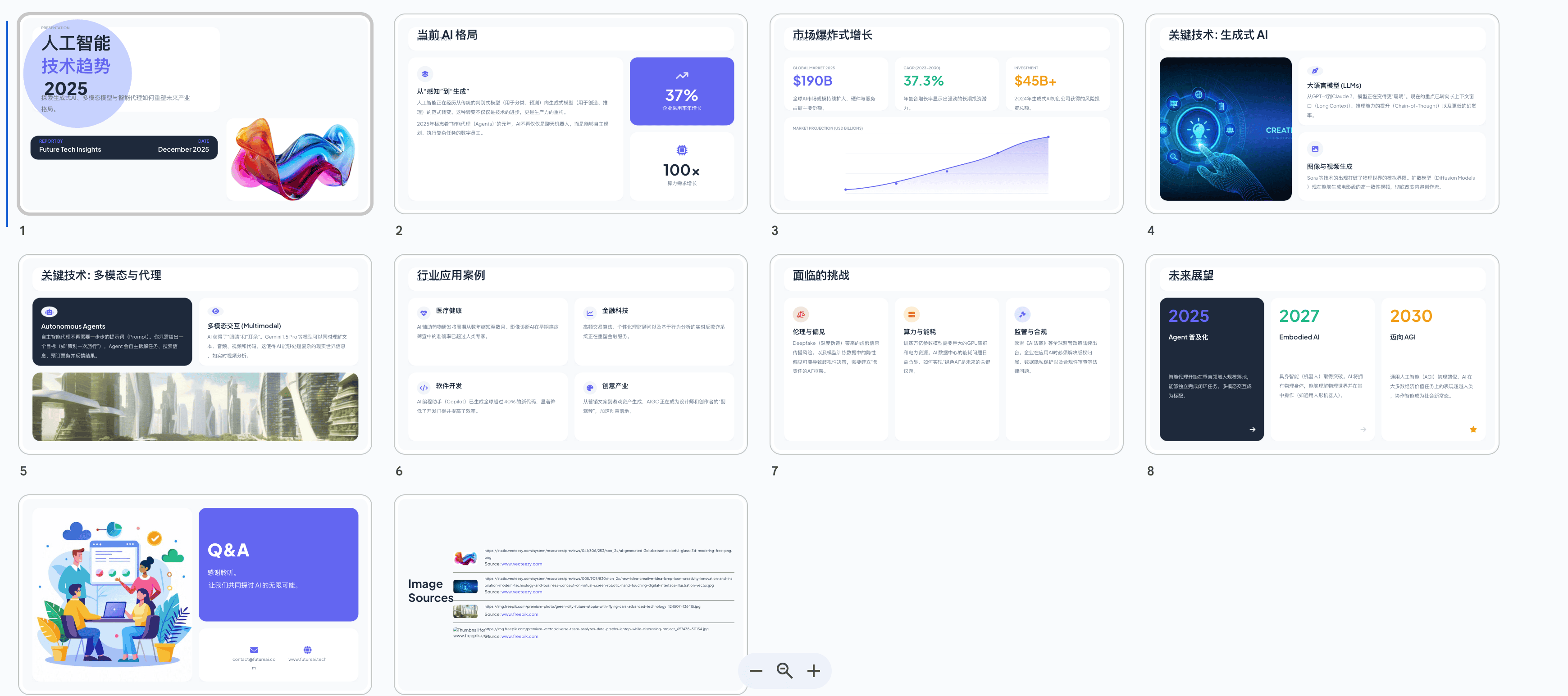
Create a presentation about "AI Technology Trends" using Bento Grid style design.

Requirements:
- Use modular card layout with clear visual hierarchy
- Apply soft shadows and rounded corners
- Color scheme: neutral tones with accent colors
- 8-10 slides covering: introduction, market analysis, key technologies, use cases, challenges, future outlook
- Include data visualizations in card format
- Modern, clean aesthetic
中文版:
制作一个关于"人工智能技术趋势"的演示文稿,采用Bento Grid便当盒布局风格。

要求:
- 使用模块化卡片布局,层次分明
- 应用柔和阴影和圆角设计
- 配色方案:中性色调搭配强调色
- 8-10页内容,包含:简介、市场分析、关键技术、应用案例、挑战、未来展望
- 以卡片形式展示数据可视化
- 现代、简洁的美学风格
5.2 2️⃣ 极简中性色(Minimalist Neutral)
风格特点:
- 🎨 浅灰、米白、深灰配色
- ✨ 留白充足,呼吸感强
- 📖 适合商务报告和专业演讲
- 🔤 Typography为主要设计元素
提示词示例:
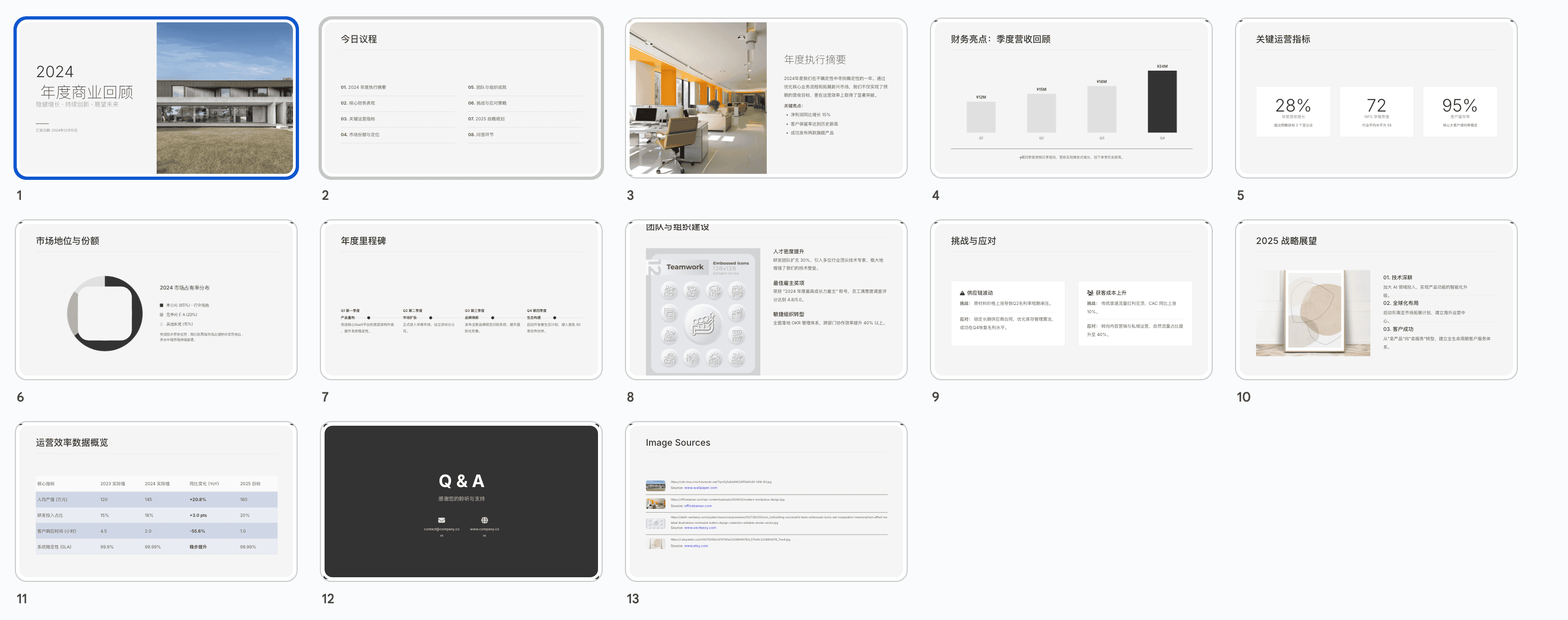
Design a minimalist presentation about "Annual Business Review 2024".

Style specifications:
- Color palette: warm grays (#F5F5F5, #E0E0E0), charcoal (#333333), off-white
- Abundant white space and clean layout
- Sans-serif typography (prefer Helvetica or Inter)
- Subtle dividers and minimal decoration
- 12-15 slides: cover, agenda, financial highlights, key metrics, team achievements, market position, challenges, strategy, Q&A
- Data charts in monochrome with single accent color
- Professional, elegant, and sophisticated look
中文版:
设计一个关于"2024年度商业回顾"的极简主义演示文稿。

风格规范:
- 配色方案:暖灰色系(#F5F5F5, #E0E0E0)、深灰色(#333333)、米白色
- 充足留白和简洁布局
- 无衬线字体(首选Helvetica或Inter)
- 细微分隔线和最小化装饰
- 12-15页:封面、议程、财务亮点、关键指标、团队成就、市场地位、挑战、战略、问答
- 单色数据图表搭配单一强调色
- 专业、优雅、精致的外观
5.3 3️⃣ 荧光绿瑞士国际主义(Neon Swiss International)
风格特点:
- 💚 荧光绿(#00FF00或#39FF14)为主强调色
- 📏 网格系统和严格对齐
- 🎯 高对比度,视觉冲击力强
- 🔲 几何形状和线条元素
提示词示例:
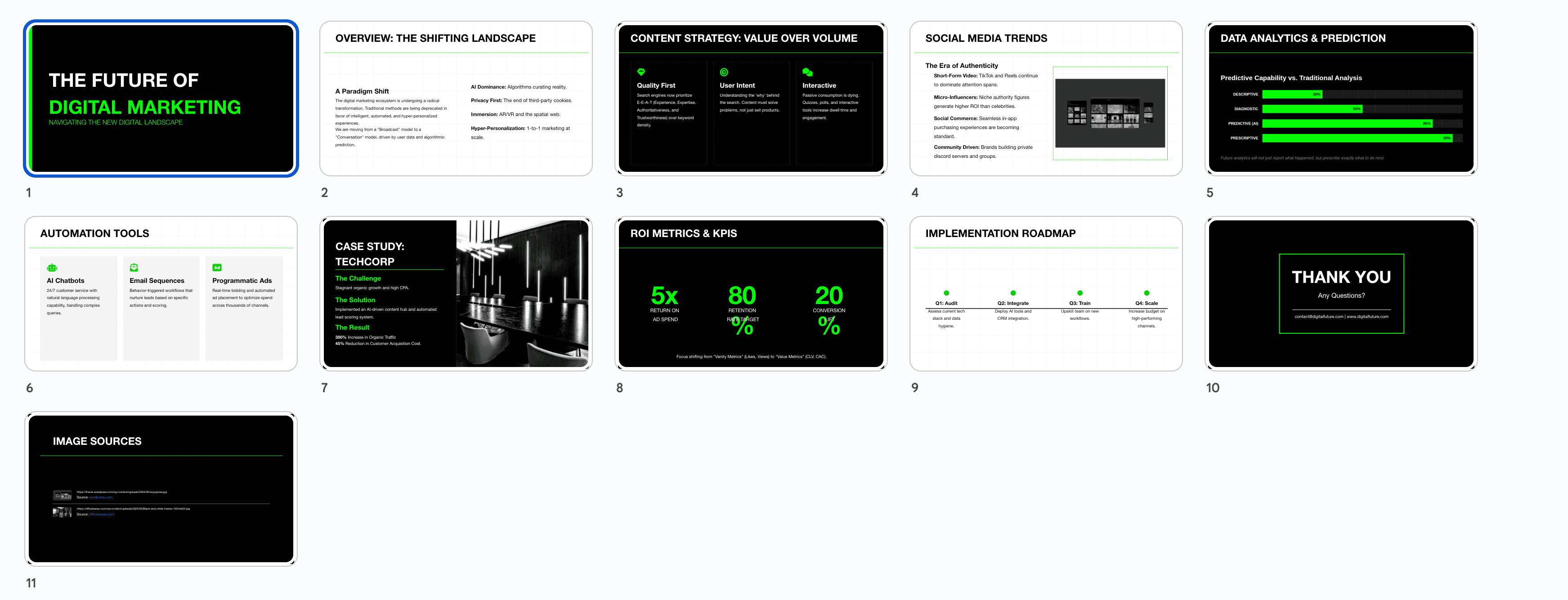
Create a presentation about "Future of Digital Marketing" in Swiss International Style with neon green accents.

Design guidelines:
- Primary colors: Black, white, neon green (#00FF00)
- Grid-based layout with precise alignment
- Geometric shapes and clean lines
- Helvetica font family exclusively
- High contrast text and backgrounds
- 10 slides: title, overview, content strategy, social media trends, data analytics, automation tools, case studies, ROI metrics, implementation roadmap, conclusion
- Charts and graphs with neon green highlights
- Bold, modern, tech-forward aesthetic
中文版:
创建一个关于"数字营销的未来"的演示文稿,采用荧光绿瑞士国际主义风格。

设计指南:
- 主色调:黑色、白色、荧光绿(#00FF00)
- 基于网格的布局,精确对齐
- 几何形状和简洁线条
- 独家使用Helvetica字体系列
- 高对比度文字和背景
- 10页内容:标题、概述、内容策略、社交媒体趋势、数据分析、自动化工具、案例研究、ROI指标、实施路线图、结论
- 图表使用荧光绿突出显示
- 大胆、现代、科技感十足的美学
5.4 4️⃣ 极简黑白(Monochrome Minimal)
风格特点:
- ⚫ 纯黑白配色,极致简约
- 🎭 强烈视觉对比
- 📐 几何图形和线条艺术
- 🖼️ 适合艺术、设计类主题
提示词示例:
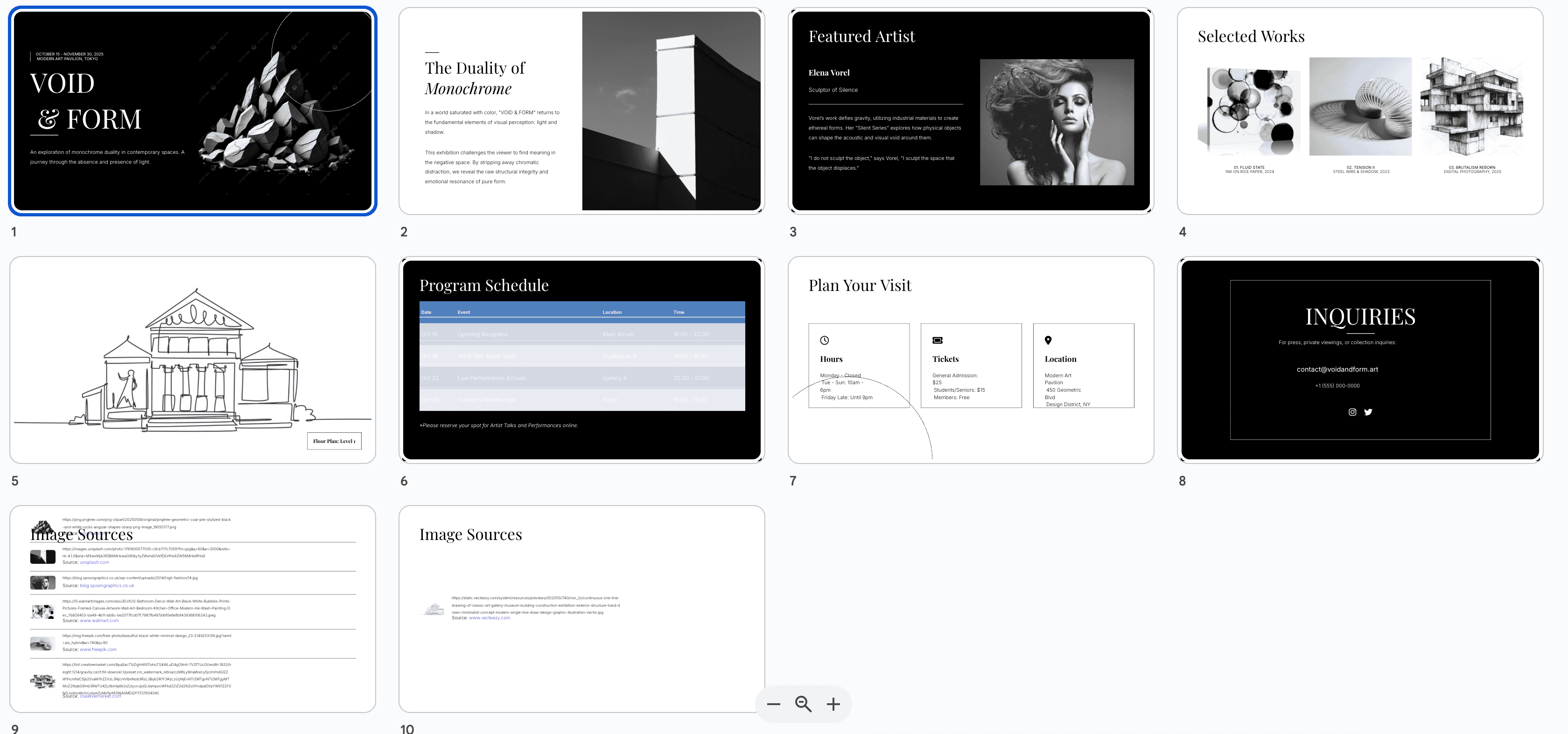
Design a black and white minimalist presentation about "Contemporary Art Exhibition".

Style requirements:
- Strict black (#000000) and white (#FFFFFF) only
- High contrast layout
- Geometric patterns and line art
- Serif and sans-serif font pairing
- Asymmetric compositions
- 8 slides: exhibition intro, featured artists, artwork showcases, themes, visitor information, events, gallery map, contact
- Use negative space creatively
- Artistic, editorial magazine style
中文版:
设计一个关于"当代艺术展览"的黑白极简演示文稿。

风格要求:
- 严格只使用纯黑色(#000000)和纯白色(#FFFFFF)
- 高对比度布局
- 几何图案和线条艺术
- 衬线字体和无衬线字体搭配
- 非对称构图
- 8页内容:展览介绍、特色艺术家、作品展示、主题、参观信息、活动、画廊地图、联系方式
- 创意运用负空间
- 艺术性、编辑杂志风格
5.5 5️⃣ 渐变色彩(Gradient Vibrant)
风格特点:
- 🌈 流畅渐变背景
- 🎨 多彩但和谐的配色
- ✨ 现代、充满活力
- 💫 适合创意、科技主题
提示词示例:
Create a vibrant gradient presentation about "Innovation in Tech Startups".

Design specifications:
- Gradient backgrounds: purple to blue, orange to pink, green to teal
- Smooth color transitions
- White or light text on gradient backgrounds
- Rounded elements and soft shadows
- Modern sans-serif fonts
- 12 slides: cover, problem statement, solution overview, product features, technology stack, market opportunity, business model, traction, team, roadmap, competition, funding
- Glassmorphism effects on cards
- Energetic, optimistic, forward-thinking vibe
中文版:
创建一个关于"科技创业公司的创新"的活力渐变演示文稿。

设计规范:
- 渐变背景:紫到蓝、橙到粉、绿到青
- 流畅的颜色过渡
- 渐变背景上使用白色或浅色文字
- 圆角元素和柔和阴影
- 现代无衬线字体
- 12页内容:封面、问题陈述、解决方案概述、产品特性、技术栈、市场机会、商业模式、发展态势、团队、路线图、竞争分析、融资
- 卡片上使用玻璃拟态效果
- 充满活力、乐观、前瞻性的氛围
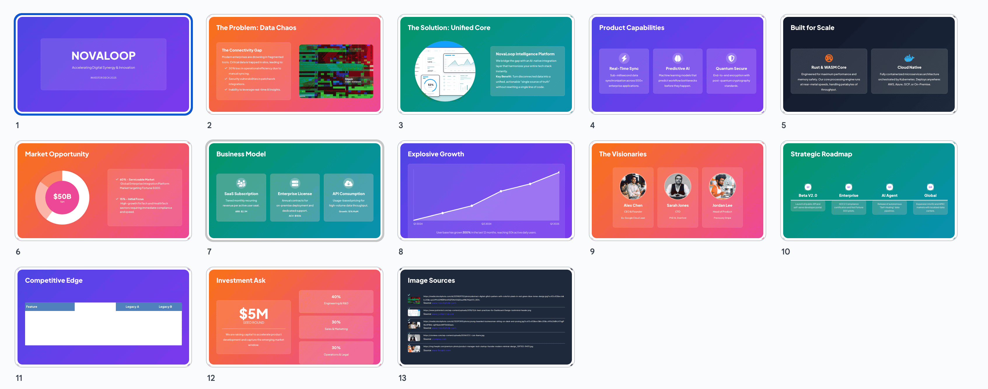
5.6 6️⃣ 企业专业(Corporate Professional)
风格特点:
- 💼 蓝色、深灰为主色调
- 📊 强调数据和图表
- 🎓 严谨、可信赖
- 📈 适合商务提案和报告
提示词示例:
Design a corporate professional presentation about "Q4 Financial Results and Strategy".

Requirements:
- Color scheme: navy blue (#003366), corporate blue (#0066CC), gray (#666666), white
- Clean, structured layout
- Professional sans-serif fonts
- Emphasis on data visualization (bar charts, line graphs, pie charts)
- 15 slides: title, executive summary, financial highlights, revenue breakdown, expense analysis, profit margins, market share, competitor comparison, regional performance, product performance, risk factors, strategic initiatives, forecast, recommendations, appendix
- Include company logo and branding
- Conservative, trustworthy, authoritative style
中文版:
设计一个关于"第四季度财务结果与战略"的企业专业演示文稿。

要求:
- 配色方案:海军蓝(#003366)、企业蓝(#0066CC)、灰色(#666666)、白色
- 简洁、结构化布局
- 专业无衬线字体
- 强调数据可视化(柱状图、折线图、饼图)
- 15页内容:标题、执行摘要、财务亮点、收入细分、费用分析、利润率、市场份额、竞争对比、区域表现、产品表现、风险因素、战略举措、预测、建议、附录
- 包含公司标志和品牌元素
- 保守、可信、权威的风格
6 🌟 各平台用户分享的实用技巧
6.1 🐦 X平台(Twitter)用户经验
@DesignPro_AI 分享:
-
💡 分段提示技巧:不要一次性输入所有要求,先生成基础版本,再逐步优化
- 第1轮:
Create a 10-slide presentation about AI in healthcare - 第2轮:
Change the color scheme to medical blue and white - 第3轮:
Add patient case study on slide 5
- 第1轮:
@PPTWizard 技巧:
- 🎯 使用参考语:在提示词中加入”like Apple Keynote style”或”similar to TED talk presentations”
- 📸 图片占位符:明确指出需要图片的位置,如”include a hero image on the title slide”
@CreativeAI_User 建议:
- 🔄 迭代优化法:每次只修改1-2个元素,避免大幅度改动导致风格混乱
- 📝 保存版本提示词:把成功的提示词保存下来,建立个人提示词库
6.2 📚 知乎用户实战分享
用户”AI设计师小王”:
- ✅ 内容先行原则:先用Gemini生成内容大纲,确认无误后再添加设计要求
- 🎨 配色参考法:提供具体的色值(HEX代码),而不是模糊的”蓝色”、“红色”
- 📊 数据可视化技巧:明确指定图表类型,如”使用堆叠柱状图展示三年对比数据”
用户”效率工具达人”:
-
⚡ 快速模板法:
- 先让Gemini生成标准模板
- 保存为Google Slides模板
- 后续直接在模板基础上修改内容
-
🔍 细节控制:使用”放大第二页标题的字号至48pt”这样的精确指令
用户”演讲培训师Lisa”:
- 🎤 演讲者视角:在提示词中加入”suitable for 30-minute presentation”,Gemini会调整内容密度
- 📱 多场景适配:同时要求”ensure readability on mobile devices”,生成的PPT在小屏幕上也清晰
6.3 🎬 B站用户创作技巧
UP主”PPT超人”:
- 🎥 动画效果:虽然Gemini Canvas不直接生成动画,但可以在提示词中说明”design with animation in mind”,布局会更适合后期添加动画
- 🖼️ 图文比例:建议使用”70% visual, 30% text”这样的比例描述
UP主”设计小白进阶”:
-
📐 布局模板词汇:
- “Hero image layout”(大图布局)
- “Split-screen design”(分屏设计)
- “Full-bleed background”(全出血背景)
- “Centered content with sidebar”(中心内容+侧边栏)
UP主”AI工具测评”:
-
🔧 问题修复技巧:
- 文字重叠:
Increase line spacing and padding - 颜色不协调:
Apply analogous color harmony - 层次不清:
Enhance visual hierarchy with size and weight variations
- 文字重叠:
6.4 🎨 优设网设计师建议
设计师”视觉老司机”:
-
🎯 设计原则融入提示词:
- 对比:
Use high contrast between headings and body text - 对齐:
Ensure all elements align to a grid system - 重复:
Maintain consistent styling across all slides - 亲密性:
Group related information visually
- 对比:
设计师”配色大师”:
-
🌈 配色方案推荐:
- 商务:
Navy blue + gold accents - 科技:
Dark mode with cyan highlights - 教育:
Warm earth tones - 创意:
Complementary color scheme with purple and yellow
- 商务:
设计师”版式专家”:
-
📏 黄金比例应用:在提示词中加入”apply golden ratio to layout proportions”
-
🔤 字体配对建议:
- 经典组合:
Playfair Display for headings, Open Sans for body - 现代组合:
Montserrat Bold + Roboto Light - 优雅组合:
Cormorant Garamond + Lato
- 经典组合:
7 ⚠️ 操作技巧与注意事项
7.1 ✅ 最佳实践
-
🎯 明确目标受众
- 在提示词中说明受众类型:“for C-level executives”、“for technical team”、“for general public”
- Gemini会相应调整专业术语的使用和内容深度
-
📝 结构化提示词
- 使用分段标注:Topic / Style / Color Scheme / Number of Slides / Special Requirements
- 便于AI理解并生成符合预期的结果
-
🔄 渐进式调整
- 先生成整体框架,再优化细节
- 避免频繁推翻重来,浪费时间
-
💾 及时保存
- 每完成一个满意的版本立即导出
- 可以保留多个版本供对比选择
-
🎨 善用视觉参考
- 在提示词中引用知名品牌风格:“Apple-like minimalism”、“Netflix-style bold typography”
- 提供参考案例链接(如果可能)
7.2 🚫 常见错误与避坑指南
-
❌ 提示词过于简单
- 错误示例:
Make a PPT about marketing - 正确示例:
Create a 12-slide presentation about digital marketing strategies for small businesses, using modern flat design with blue and orange color scheme, include case studies and data visualizations
- 错误示例:
-
❌ 频繁大幅修改
- 问题:反复修改核心风格导致前后不一致
- 解决:确定风格后只做微调,大改建议重新生成
-
❌ 忽视导出后编辑
- 问题:期望Gemini生成100%完美的最终版
- 现实:Canvas是快速原型工具,细节需在Google Slides中调整
-
❌ 内容过载
- 问题:单页放入过多信息
- 解决:遵循”一页一个核心观点”原则,在提示词中说明”one key message per slide”
-
❌ 忽略可读性
- 问题:字体过小、对比度不足
- 解决:提示词中加入”ensure high readability”、“minimum 24pt font for body text”
-
❌ 配色混乱
- 问题:使用过多颜色
- 解决:限制在3-4种主色,提示词明确”use only 3 primary colors”
-
❌ 没有视觉层次
- 问题:所有元素看起来一样重要
- 解决:要求”establish clear visual hierarchy with size, weight, and color”
-
❌ 图片导出丢失
- 问题:Canvas生成的PPT里有AI配图,但你自己上传的图片导出时可能丢失
- 解决:需要的配图,导出到Google Slides后再手动添加
-
❌ 前后风格不统一
- 问题:生成10页,前几页和后几页风格不一样
- 解决:提示词里加一句”保持所有页面风格一致”,或者生成后逐页统一调整
-
❌ 中文字体不好看
- 问题:有时中文字体渲染效果不佳
- 解决:导出到Google Slides后手动更换字体(推荐思源黑体、苹方)
-
❌ 长文档漏内容
- 问题:上传很长的文档,AI可能遗漏信息
- 解决:先整理成摘要再上传,或者分段传递
7.3 🔍 质量检查清单
完成PPT后,逐项检查:
- 内容完整性:所有要点都包含了吗?
- 逻辑连贯性:页面之间的衔接流畅吗?
- 视觉一致性:风格、配色、字体在所有页面统一吗?
- 可读性:文字大小合适吗?对比度足够吗?
- 数据准确性:图表数据正确吗?
- 品牌一致性:符合公司品牌形象吗?
- 移动适配:在小屏幕上也清晰吗?
- 打印效果:如果需要打印,颜色和布局合适吗?
8 📚 高质量提示词模板和案例
8.1 模板1:商业提案模板
Create a professional business proposal presentation for [Company/Product Name].

Content Structure (15 slides):
1. Cover slide with company logo
2. Executive summary
3. Problem statement
4. Market analysis and opportunity
5. Solution overview
6. Product/service features (2-3 slides)
7. Business model
8. Go-to-market strategy
9. Competitive landscape
10. Financial projections
11. Team introduction
12. Milestones and roadmap
13. Investment ask (if applicable)
14. Contact information
15. Appendix

Design Style:
- Corporate professional with modern touch
- Color scheme: [Specific colors with HEX codes]
- Clean layout with ample white space
- Data visualizations for market data and financials
- Professional sans-serif fonts
- Include high-quality image placeholders

Special Requirements:
- Suitable for 45-minute investor presentation
- Emphasis on visual storytelling
- Include call-to-action on final slide
实际应用案例:
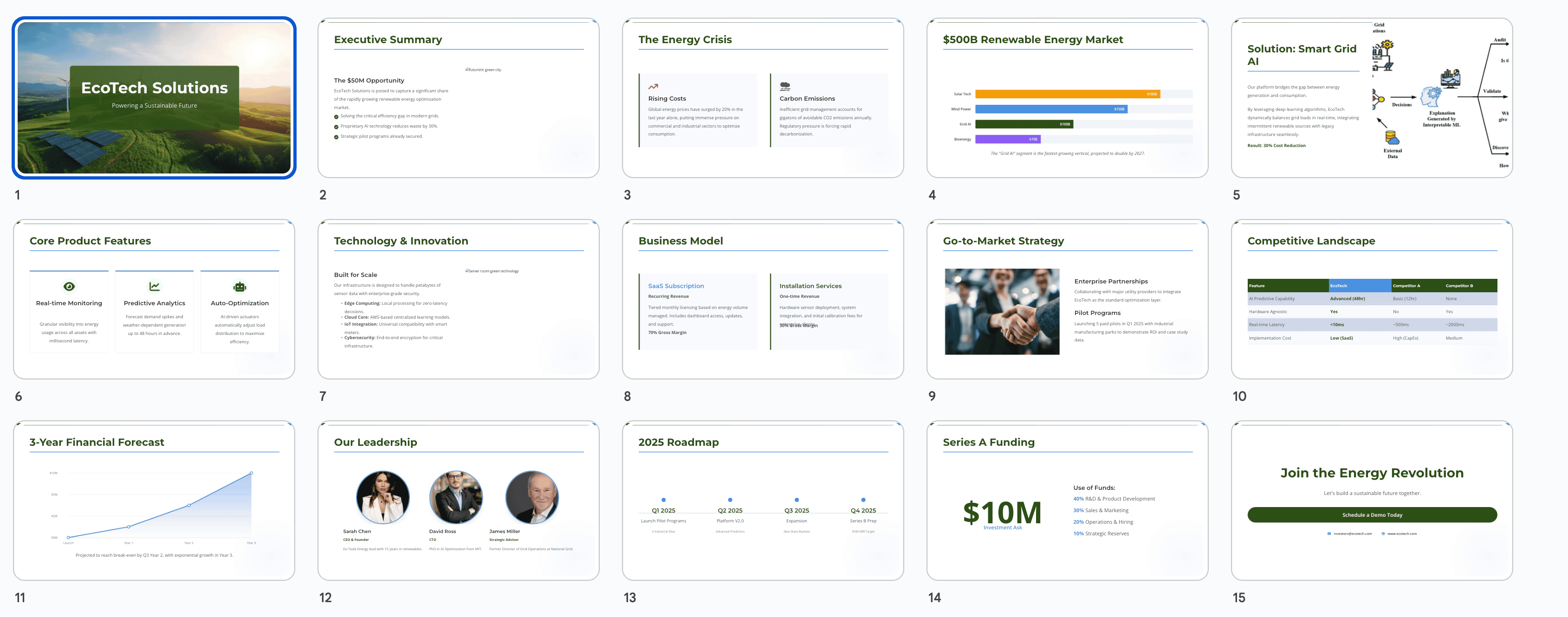
Create a professional business proposal presentation for "EcoTech Solutions" - a sustainable energy startup.

Content Structure (15 slides):
1. Cover slide with EcoTech logo and tagline
2. Executive summary highlighting $50M market opportunity
3. Problem: Rising energy costs and carbon emissions
4. Market analysis: $500B renewable energy market
5. Solution: AI-powered smart grid optimization
6. Product features: Real-time monitoring, predictive analytics, automated optimization
7. Technology stack and innovation
8. Business model: SaaS subscription + installation services
9. Go-to-market: Enterprise partnerships and pilot programs
10. Competitive landscape: Comparison with 3 main competitors
11. Financial projections: 3-year forecast
12. Team: Founders and key advisors with photos
13. Milestones: Q1-Q4 2025 roadmap
14. Series A funding ask: $10M with use of funds
15. Contact and next steps

Design Style:
- Corporate professional with eco-friendly aesthetic
- Color scheme: Forest green (#2D5016), sky blue (#4A90E2), charcoal (#333333), white
- Clean layout with 40% white space
- Include bar charts for market data and line graphs for financial projections
- Font pairing: Montserrat for headings, Open Sans for body
- Hero images of renewable energy installations

Special Requirements:
- Suitable for 45-minute investor presentation
- Emphasis on visual storytelling over text
- Include "Schedule Demo" call-to-action on final slide
- Ensure all charts are colorblind-friendly
8.2 模板2:教育培训模板
Design an educational presentation about [Topic] for [Audience Level].

Learning Objectives:
- [Objective 1]
- [Objective 2]
- [Objective 3]

Content Outline (10-12 slides):
1. Title slide with topic and instructor info
2. Learning objectives and agenda
3. Introduction to key concepts
4. Main content sections (5-7 slides with examples)
5. Interactive elements/discussion prompts
6. Case study or real-world application
7. Summary and key takeaways
8. Q&A slide
9. Additional resources
10. Thank you and contact

Design Specifications:
- Friendly, approachable style
- Color scheme: [Warm, inviting colors]
- Large, clear fonts for readability
- Visual aids: diagrams, icons, illustrations
- Consistent formatting for definitions and examples
- Space for instructor notes

Pedagogical Considerations:
- Clear information hierarchy
- Visual reinforcement of key points
- Engaging layout to maintain attention
- Accessibility features (high contrast, readable fonts)
实际应用案例:
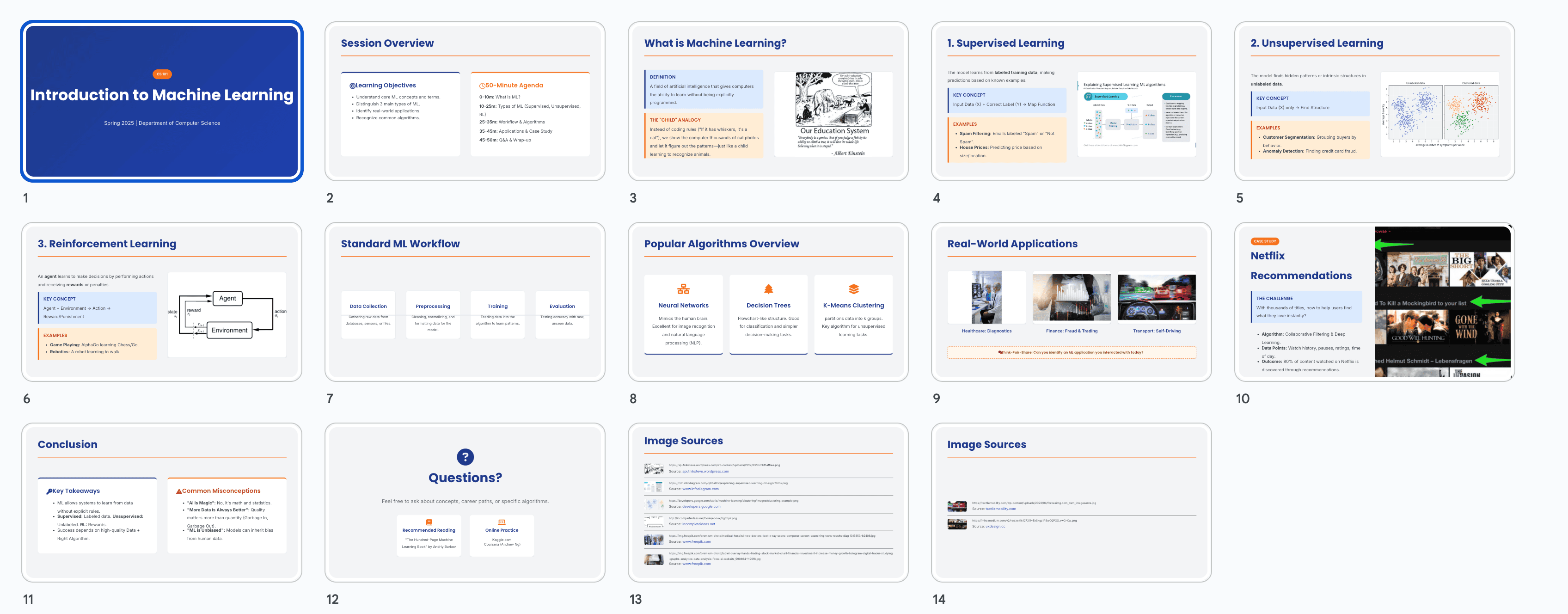
Design an educational presentation about "Introduction to Machine Learning" for undergraduate computer science students.

Learning Objectives:
- Understand fundamental ML concepts and terminology
- Distinguish between supervised, unsupervised, and reinforcement learning
- Recognize real-world ML applications
- Identify when to apply different ML algorithms

Content Outline (12 slides):
1. Title: "Introduction to Machine Learning" with course code
2. Learning objectives and 50-minute session agenda
3. What is Machine Learning? Definition and scope
4. Types of ML: Supervised learning explained with examples
5. Types of ML: Unsupervised learning explained with examples
6. Types of ML: Reinforcement learning explained with examples
7. ML Workflow: Data collection → Preprocessing → Training → Evaluation
8. Popular ML algorithms overview (decision trees, neural networks, clustering)
9. Real-world applications: Healthcare, finance, autonomous vehicles
10. Case study: Netflix recommendation system
11. Key takeaways and common misconceptions
12. Q&A, recommended books and online courses

Design Specifications:
- Friendly academic style with modern touch
- Color scheme: Academic blue (#1E3A8A), warm orange (#F97316), light gray (#F3F4F6)
- Font: Poppins for headings (32pt min), Inter for body (20pt min)
- Visual aids: Flow diagrams for ML workflow, icons for algorithm types, screenshots for applications
- Consistent blue boxes for definitions, orange boxes for examples
- Leave 30% of space for instructor verbal explanations

Pedagogical Considerations:
- Progressive disclosure: introduce concepts from simple to complex
- Use analogies: "ML is like teaching a child to recognize animals"
- Color-code different ML types consistently
- Include "Think-Pair-Share" prompt on slide 9
- High contrast (WCAG AA compliant) for accessibility
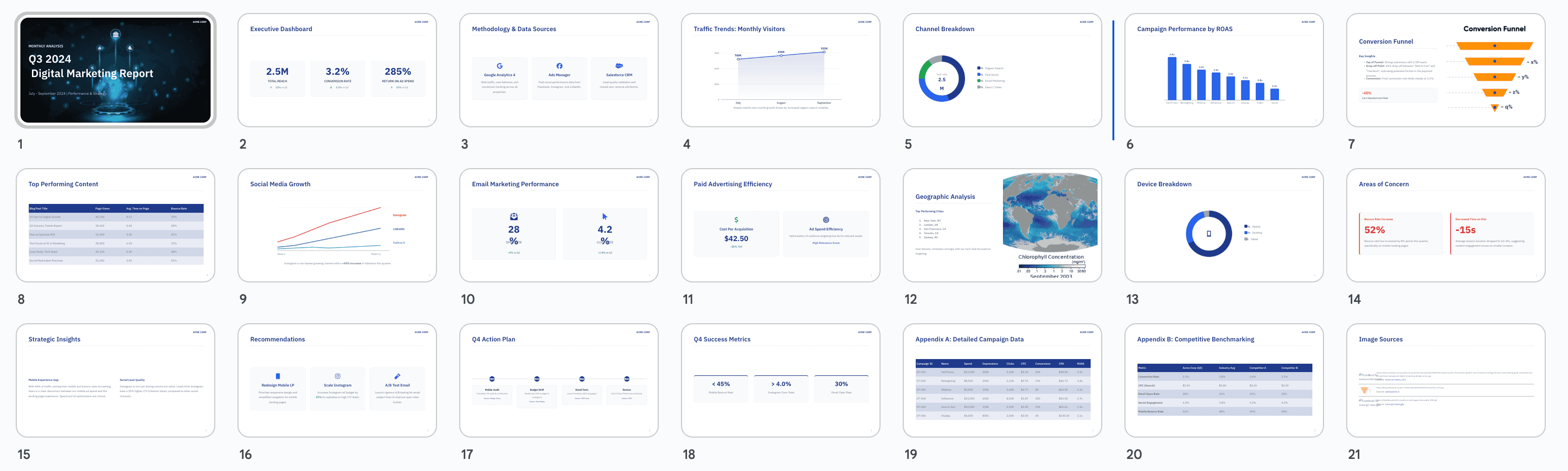
8.3 模板3:产品发布模板
Create a product launch presentation for [Product Name].

Presentation Flow (12-14 slides):
1. Teaser/hook slide
2. Company introduction
3. Market context and user pain points
4. Introducing [Product Name] - hero slide
5. Key features showcase (3-4 slides with visuals)
6. How it works - user journey
7. Benefits and value proposition
8. Pricing and packages
9. Customer testimonials/early reviews
10. Comparison with alternatives
11. Availability and launch timeline
12. Call-to-action
13. Social media and community
14. Thank you and contact

Design Approach:
- Exciting, energetic style
- Brand colors with vibrant accents
- Large product images and screenshots
- Animated feel (design with motion in mind)
- Bold typography for impact
- Gradient or dynamic backgrounds

Messaging:
- Focus on benefits over features
- Use emotional appeal
- Include social proof
- Create urgency for launch offer
实际应用案例:
Create a product launch presentation for "FitPulse" - an AI-powered fitness tracking smartwatch.

Presentation Flow (14 slides):
1. Teaser: "Your Health. Reimagined." with product silhouette
2. Company: FitPulse Inc. - 5 years in health tech innovation
3. Market context: 67% of fitness trackers abandoned within 6 months - why?
4. Introducing FitPulse: The smartwatch that actually understands you
5. Feature 1: AI Coach - personalized workout recommendations
6. Feature 2: Health Insights - predictive health alerts
7. Feature 3: Social Fitness - compete with friends
8. Feature 4: 14-day battery + waterproof design
9. User journey: From morning wake-up to bedtime sleep tracking
10. Benefits: Lose weight 3x faster (backed by pilot study), prevent injuries, stay motivated
11. Pricing: Early bird $199 (regular $299), FitPulse Plus subscription $9.99/month
12. Testimonials: 3 beta testers with photos and quotes
13. FitPulse vs. competitors (Apple Watch, Fitbit, Garmin) - comparison table
14. Pre-order now: 20% off for first 1000 customers, ships March 2025
15. Join our community: Instagram, Discord, newsletter signup
16. Thank you - Contact: [email protected]

Design Approach:
- Energetic, youthful style with fitness imagery
- Brand colors: Electric blue (#00D9FF), vibrant purple (#9D4EDD), black, white
- Large product photos showing watch on diverse users
- Gradient backgrounds transitioning from blue to purple
- Bold sans-serif: Inter Black for headings, Inter Regular for body
- Feature slides use split-screen: product image + benefit text
- Chart animations suggested for comparison slide

Messaging:
- Headline formula: [Action verb] + [Benefit] → "Track smarter. Live healthier."
- Use power words: "Revolutionary," "Intelligent," "Personalized"
- Include stat: "10,000+ beta testers, 4.8★ average rating"
- Create urgency: "Limited early bird pricing ends soon!"
- Social proof: "Featured in TechCrunch and Wired"
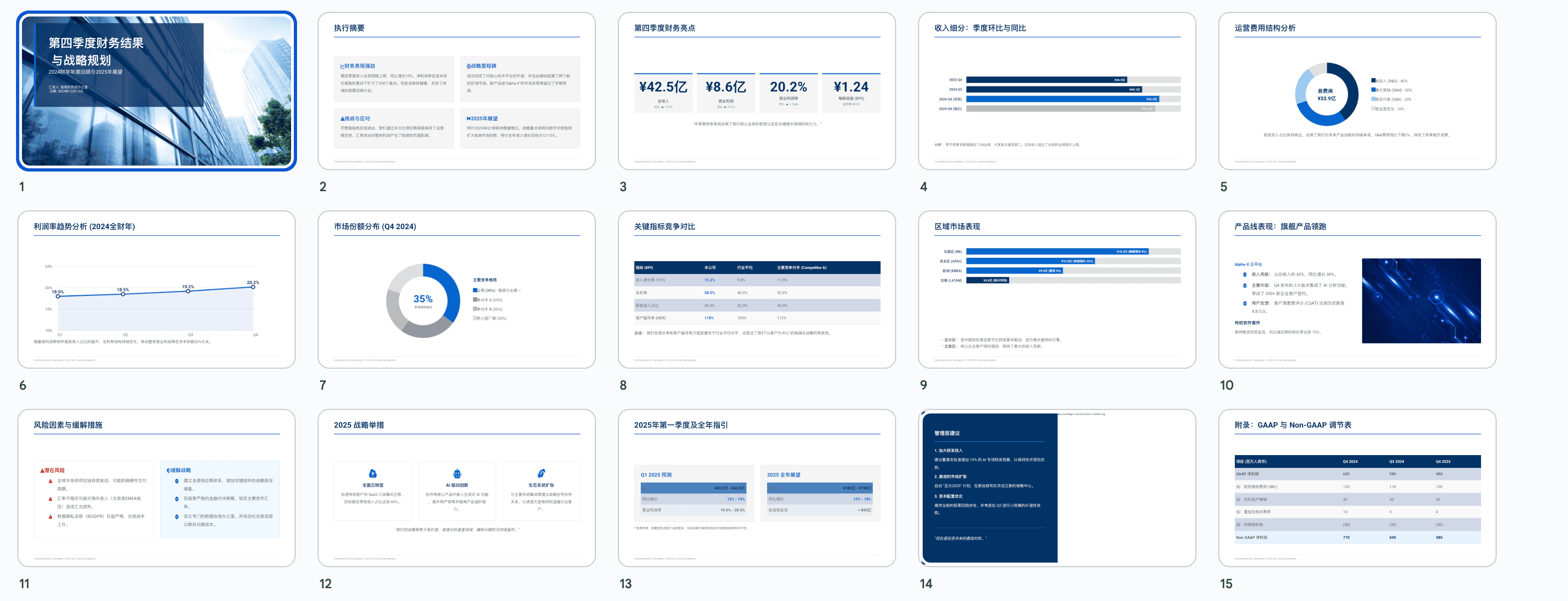
8.4 模板4:数据报告模板
Generate a data-driven report presentation about [Topic/Metrics].

Report Structure (15-20 slides):
1. Cover with report title and date range
2. Executive dashboard - key metrics overview
3. Methodology and data sources
4. Trend analysis (3-4 slides with charts)
5. Segment breakdown
6. Performance highlights
7. Areas of concern
8. Comparative analysis (YoY, QoQ, or vs. benchmarks)
9. Deep dive sections (2-3 focus areas)
10. Insights and interpretations
11. Recommendations
12. Action plan
13. Success metrics and KPIs
14. Next steps
15. Appendix with detailed tables

Visualization Requirements:
- Diverse chart types: line graphs, bar charts, pie charts, heatmaps
- Consistent color coding for categories
- Clear labels and legends
- Highlight significant data points
- Use data callouts for key numbers

Design Guidelines:
- Professional, analytical style
- Minimal distraction from data
- High contrast for chart readability
- Gridlines and reference lines where helpful
- Corporate color scheme
实际应用案例:
Generate a data-driven report presentation about "Q3 2024 Digital Marketing Performance".

Report Structure (18 slides):
1. Cover: "Q3 2024 Digital Marketing Report" | July-September 2024
2. Executive dashboard: Total reach 2.5M, Conversion rate 3.2%, ROI 285%
3. Methodology: Data from Google Analytics, Facebook Ads Manager, Salesforce CRM
4. Traffic trends: Line graph showing monthly visitors (July: 780K, Aug: 850K, Sep: 920K)
5. Channel breakdown: Pie chart - Organic 45%, Paid Social 30%, Email 15%, Direct 10%
6. Campaign performance: Bar chart comparing 8 campaigns by ROAS
7. Conversion funnel: Sankey diagram showing drop-off points
8. Top performing content: Table with top 10 blog posts and engagement metrics
9. Social media growth: Multi-line graph for Instagram, LinkedIn, Twitter followers
10. Email marketing: Open rate 28% (+5% vs Q2), Click rate 4.2% (+0.8%)
11. Paid advertising: Cost per acquisition down 18%, ad spend efficiency improved
12. Geographic analysis: Heatmap of user locations, top 5 cities called out
13. Device breakdown: Mobile 68%, Desktop 28%, Tablet 4%
14. Areas of concern: Bounce rate increased to 52%, time on site decreased
15. Insights: Mobile experience needs optimization, Instagram driving quality leads
16. Recommendations: 1) Redesign mobile landing pages, 2) Increase Instagram budget by 25%, 3) A/B test email subject lines
17. Q4 Action Plan: Timeline with 3 major initiatives and owners
18. Success metrics: Track mobile bounce rate, Instagram conversion rate, email engagement
19. Appendix A: Detailed campaign data tables
20. Appendix B: Competitive benchmarking data

Visualization Requirements:
- Line graphs with markers for trend analysis
- Stacked bar charts for channel comparison
- Donut charts for percentage breakdowns
- Use RED (#DC2626) for negative trends, GREEN (#16A34A) for positive trends
- Neutral BLUE (#2563EB) for informational data
- Data callouts in bold: "+18% YoY" next to relevant data points
- Include confidence intervals on projections

Design Guidelines:
- Professional analytical style, minimal decoration
- Color scheme: Navy (#1E3A8A), gray (#6B7280), white background
- Consistent chart styling across all slides
- Font: IBM Plex Sans for clean, technical look
- High contrast: black text on white, white text on navy
- Gridlines in light gray (#E5E7EB) for reference
- Logo in top right corner of each slide
- Slide numbers in bottom right
- Leave margins for note-taking
9 ❓ 常见问题和解决方案
9.1 Q1: Gemini Canvas生成的PPT可以导出为PowerPoint格式吗?
A: 可以,但需要两步操作:
- 首先将Gemini生成的演示文稿导出为Google Slides格式
- 在Google Slides中,选择”文件” → “下载” → “Microsoft PowerPoint (.pptx)”
⚠️ 注意:某些特殊效果在转换过程中可能会有轻微变化,建议导出后检查格式。
9.2 Q2: 为什么有时候Gemini不按我的要求生成特定风格?
A: 可能的原因和解决方案:
原因1:提示词不够具体
- ❌ 错误:
用现代风格 - ✅ 正确:
使用极简主义现代风格,包含大量留白,无衬线字体,中性色调
原因2:风格描述矛盾
- 问题:同时要求”极简”和”丰富装饰”
- 解决:明确优先级,如”以极简为主,适度添加几何装饰元素”
原因3:参考模糊
- 改进:使用具体品牌作为参考,如”Apple Keynote风格”而不是”高端风格”
技巧:分阶段描述
Step 1: Create basic structure
Step 2: Apply minimalist design with [specific characteristics]
Step 3: Adjust color scheme to [specific colors]
9.3 Q3: 生成的PPT文字过多,如何控制内容密度?
A: 在提示词中添加明确限制:
Content Guidelines:
- Maximum 3 bullet points per slide
- Each bullet point: 10-15 words maximum
- Use large font sizes: headings 40pt+, body 24pt+
- Follow "one slide, one message" principle
- Prioritize visuals over text (70% visual, 30% text ratio)
补救方法: 如果已经生成,使用指令:
Reduce text on slide 3 to 3 key points onlyReplace paragraph on slide 5 with bullet pointsCondense the content and make it more visual
9.4 Q4: 颜色搭配不协调怎么办?
A: 使用标准配色方案和色值:
方法1:提供精确色值
Color Palette:
- Primary: #2C3E50 (dark slate)
- Secondary: #3498DB (bright blue)
- Accent: #E74C3C (coral red)
- Background: #FFFFFF (white)
- Text: #2C3E50 (dark slate)
方法2:使用配色工具
- 访问 Coolors.co 或 Adobe Color
- 生成和谐配色方案
- 在提示词中引用完整色值
方法3:参考知名品牌
Use color scheme similar to:
- Stripe: purple (#635BFF) and light backgrounds
- Spotify: green (#1DB954) with black
- Airbnb: coral (#FF5A5F) with neutral tones
9.5 Q5: 如何让Gemini生成更专业的图表?
A: 明确指定图表类型和数据展示方式:
Data Visualization Requirements:

Slide 4 - Revenue Trend:
- Use line chart with 3 lines (2022, 2023, 2024)
- Y-axis: Revenue in millions ($0-$50M)
- X-axis: Quarters (Q1-Q4)
- Include data labels on key points
- Use color coding: 2022 (gray), 2023 (blue), 2024 (green)

Slide 7 - Market Share:
- Use donut chart
- Show top 5 companies with percentages
- Our company highlighted in brand color
- Others in neutral gray
- Include legend

Slide 10 - User Growth:
- Use stacked area chart
- Show organic vs. paid user growth
- Time period: Jan 2023 - Sep 2024
- Smooth curves, not jagged lines
图表类型选择建议:
- 📈 趋势对比 → 折线图 (Line Chart)
- 📊 数量对比 → 柱状图 (Bar Chart)
- 🥧 占比分析 → 饼图/环形图 (Pie/Donut Chart)
- 📉 相关性分析 → 散点图 (Scatter Plot)
- 🗺️ 地理分布 → 地图热图 (Heatmap)
- 🌊 流程转化 → 桑基图 (Sankey Diagram)
9.6 Q6: 生成的PPT在手机上看不清楚怎么办?
A: 在提示词中添加移动优先设计要求:
Mobile-Responsive Design:
- Minimum font size: 24pt for body, 36pt for headings
- High contrast ratios (WCAG AA standard)
- Avoid small icons or intricate details
- Test readability at 50% zoom
- Single column layout preferred
- Large touch targets for interactive elements
检查清单:
- 文字够大(手臂距离可读)
- 对比度高(黑白灰不依赖色彩)
- 信息层次清晰(标题、正文区分明显)
- 图片清晰(高分辨率)
9.7 Q7: 如何快速制作不同语言版本的PPT?
A: 分步骤操作:
步骤1:生成英文版(推荐)
- 英文提示词通常效果最好
- 先用英文生成完整版本
步骤2:翻译特定页面
Translate slides 1-5 to Chinese, maintaining the same design and layout.

Translation guidelines:
- Use simplified Chinese characters
- Adapt font to Chinese-friendly typeface (e.g., Noto Sans SC, Source Han Sans)
- Adjust text size if necessary for readability
- Keep English technical terms where appropriate
步骤3:文化适配
- 调整颜色(某些颜色在不同文化有不同含义)
- 修改案例(使用本地化案例)
- 调整数据格式(日期、货币格式)
批量处理技巧:
Create two versions:
Version A: English for international audience
Version B: Chinese for domestic market

Differences:
- Language: English vs. Simplified Chinese
- Case studies: Global brands vs. Chinese companies
- Date format: MM/DD/YYYY vs. YYYY年MM月DD日
- Keep design style identical across versions
9.8 Q8: Gemini Canvas有页数限制吗?
A:
- 理论限制:Gemini可以生成较长的演示文稿(20-30页)
- 实际建议:保持在10-15页效果最好
- 更长的PPT可能导致风格一致性下降
- 生成时间会显著增加
- 后续修改更困难
长PPT解决方案:
- 分段生成法:
Part 1: Create slides 1-10 (Introduction to Problem Analysis) Part 2: Create slides 11-20 (Solutions and Implementation) Part 3: Create slides 21-25 (Results and Conclusion) - 模块化设计:每个部分独立生成,后期在Google Slides中合并
- 主从结构:主PPT保持简洁,详细内容放在附录或备用文档
9.9 Q9: 如何处理品牌一致性要求?
A: 在提示词中详细说明品牌规范:
Brand Guidelines for [Company Name]:

Logo:
- Placement: Top right corner, 80px × 80px
- Clear space: Minimum 20px around logo
- Use full-color version on light backgrounds

Colors (strictly follow):
- Primary Brand Color: #[HEX] - use for headings and key elements
- Secondary Color: #[HEX] - use for accents and highlights
- Neutral: #[HEX] - use for body text
- Background: #[HEX]

Typography:
- Headings: [Brand Font] Bold, [Size]pt
- Body: [Brand Font] Regular, [Size]pt
- Never use: Comic Sans, Papyrus, or decorative fonts

Visual Style:
- Photography style: [Description, e.g., "bright, lifestyle, diverse people"]
- Icon style: [Description, e.g., "line icons, minimalist"]
- Graphic elements: [Description, e.g., "rounded corners, subtle shadows"]

Tone of Voice:
- Professional yet approachable
- Avoid jargon
- Use active voice
品牌资产引用:
- 如果有品牌手册链接,在提示词中提及
- 提供示例页面作为参考
- 明确禁止使用的元素
9.10 Q10: 生成的PPT缺少我想要的特定元素,怎么补充?
A: 使用增量指令逐步添加:
# 添加特定元素的指令模板

Add to Slide [X]:
- [Element type, e.g., "data chart", "image placeholder", "quote box"]
- Position: [Location, e.g., "center", "bottom right", "left side"]
- Size: [Dimensions or proportion, e.g., "50% of slide width"]
- Style: [Specific styling, e.g., "with drop shadow", "rounded corners"]
- Content: [Specific content if applicable]

Example:
Add to Slide 5:
- A timeline infographic
- Position: Horizontally centered, spanning full width
- Size: 800px wide × 200px tall
- Style: Modern, with circular nodes and connecting lines
- Content: Show 4 milestones from 2020 to 2024
常见补充元素:
- 📊 图表:
Add a bar chart comparing X, Y, Z on slide 3 - 🖼️ 图片:
Insert a hero image placeholder at the top of slide 1 - 💬 引用:
Add a customer testimonial quote box on slide 8 - 🔢 数据:
Include key statistics (3 numbers with labels) on slide 2 - ➡️ 箭头/流程:
Add a 4-step process flow diagram on slide 6 - 📌 图标:
Use icons to represent each bullet point on slide 4
10 🎯 创意应用场景
10.1 🎓 教育与培训
场景:线上课程内容课件
- 快速为每节课生成视觉化教学材料
- 统一视觉风格,增强品牌识别
- 易于更新和迭代课程内容
案例:编程训练营
每周生成新的代码教学PPT:
- 第1周:Python基础语法(15页)
- 第2周:数据结构与算法(18页)
- 第3周:Web开发入门(20页)
使用统一的配色和代码高亮风格
10.2 💼 销售与市场营销
场景:定制化客户提案
- 为不同客户快速生成个性化提案
- 保持品牌一致性的同时突出客户痛点
- 数据可视化展示ROI和案例
案例:SaaS销售团队
针对三类客户生成不同版本:
- 企业版:强调安全性和集成能力(20页)
- 中小企业版:突出性价比和易用性(12页)
- 初创公司版:聚焦快速部署和增长潜力(10页)
核心内容相似,但案例和数据针对性调整
10.3 📊 数据分析与报告
场景:定期业务汇报
- 自动化月度/季度报告生成
- 标准化报告模板
- 快速更新最新数据
案例:电商运营分析
每月自动生成运营报告:
- 销售数据趋势分析
- 用户行为洞察
- 库存和物流效率
- 营销活动效果评估
使用相同模板,只需更新数据和日期
10.4 🚀 产品与项目管理
场景:项目进度汇报
- Sprint回顾和规划展示
- 产品路线图可视化
- Stakeholder沟通材料
案例:敏捷开发团队
每两周生成Sprint回顾PPT:
- Sprint目标回顾
- 完成的用户故事
- 速度图表和燃尽图
- 遇到的挑战和解决方案
- 下个Sprint计划
标准化流程,节省准备时间
10.5 🎨 创意策划与提案
场景:创意概念展示
- 广告创意提案
- 品牌设计方案
- 活动策划方案
案例:品牌重塑项目
为客户生成品牌升级方案:
- 现有品牌分析
- 市场趋势和竞争对手
- 新品牌视觉方向(3个方案对比)
- Logo和VI系统展示
- 实施路线图
视觉化呈现抽象的品牌概念
10.6 🏆 活动与会议
场景:会议议程和工作坊材料
- 会议开场和议程介绍
- 工作坊活动指南
- 总结和行动计划
案例:公司年会
全天活动材料包:
- 欢迎与开场(3页)
- CEO年度总结(15页)
- 各部门成就展示(20页)
- 团建活动说明(5页)
- 颁奖典礼(10页)
- 新年展望(8页)
统一的庆典风格,激励人心
10.7 🌐 社交媒体与内容营销
场景:社媒图文内容
- 将PPT页面转为社媒图片
- Carousel帖子系列
- 信息图表生成
案例:LinkedIn知识分享
每周一个主题的Carousel系列:
- 生成10页PPT关于某个专业话题
- 每页一个要点,适合竖版阅读
- 导出为图片发布到LinkedIn
- 高质量视觉+有价值内容=高互动
10.8 📚 出版与内容创作
场景:电子书和白皮书配图
- 章节引导页
- 数据和研究可视化
- 概念解释图
案例:行业研究报告
为50页白皮书创建视觉元素:
- 封面和目录
- 10个章节引导页
- 15个数据可视化图表
- 核心观点总结页
增强报告的专业性和可读性
10.9 🎤 演讲与TED风格分享
场景:公开演讲材料
- 故事化叙事PPT
- 极简视觉辅助
- 引人深思的引语页
案例:技术峰会演讲
30分钟演讲的视觉支持(25页):
- 强烈的开场问题
- 个人故事配合大图
- 3个核心观点,每个5页深入
- 震撼的数据可视化
- 启发性的结尾
设计服务于演讲,而非代替演讲者
10.10 🔬 学术与科研
场景:论文答辩和学术会议
- 研究成果展示
- 实验流程和数据
- 学术海报设计基础
案例:硕士论文答辩
20分钟答辩PPT(15页):
- 研究背景和问题陈述
- 文献综述可视化
- 研究方法流程图
- 实验数据图表
- 结果分析和讨论
- 贡献和未来工作
学术严谨性+清晰视觉传达
11 🌱 拓展实践建议
11.1 📖 持续学习
-
关注官方更新
- 订阅Google Workspace博客
- 关注Gemini产品更新日志
- 新功能第一时间试用
-
社区交流
- 加入Reddit r/Gemini社区
- 参与X平台 GeminiAI 话题讨论
- 知乎”Gemini使用技巧”话题
-
案例研究
- 收藏优秀PPT案例
- 分析成功提示词的共同点
- 建立个人最佳实践库
11.2 🛠️ 工具组合
推荐工作流:
1. Gemini Canvas → 生成初版PPT框架
2. Google Slides → 精细调整和添加动画
3. Canva/Figma → 创建自定义图形和插图
4. Unsplash/Pexels → 获取高质量图片
5. Flaticon → 下载一致风格的图标
6. Coolors.co → 生成和谐配色方案
7. Grammarly → 检查英文文案
8. Hemingway Editor → 简化和优化文字
效率提升组合:
- Gemini + ChatGPT:Gemini生成视觉,ChatGPT优化文案
- Gemini + Notion:Notion管理内容大纲,Gemini转化为PPT
- Gemini + Airtable:Airtable存储提示词库,快速复用
11.3 📝 建立个人提示词库
分类管理:
📁 My Gemini Prompts Library
  📂 风格模板
    - 极简商务风
    - 创意渐变风
    - 学术专业风
    - 科技未来风
  📂 行业模板
    - 金融投资
    - 教育培训
    - 医疗健康
    - 电商零售
  📂 场景模板
    - 项目提案
    - 数据报告
    - 产品发布
    - 培训课件
  📂 修改指令库
    - 颜色调整
    - 布局优化
    - 字体修改
    - 图表美化
版本控制:
- 记录每次生成的提示词
- 标注效果评分(1-5星)
- 注明适用场景和注意事项
- 定期回顾和更新
11.4 🤝 团队协作最佳实践
建立团队标准:
-
统一品牌模板
- 创建公司专属提示词模板
- 包含品牌色、字体、Logo使用规范
- 全团队使用相同基础模板
-
知识共享
- 定期分享成功案例
- 内部workshop培训
- 建立FAQ文档
-
质量控制
- 设立PPT审核流程
- 使用检查清单
- 同行评审制度
11.5 🎯 进阶技巧探索
-
多模态结合
- 结合Gemini的图像生成能力
- 用AI生成配图,再整合到PPT
- 视频脚本+PPT配套生成
-
自动化工作流
- 使用API(如果可用)批量生成
- 结合Google Apps Script自动化
- 定时生成定期报告
-
A/B测试
- 生成多个版本进行对比
- 测试不同风格的受众反应
- 数据驱动优化提示词
11.6 📈 个人成长路径
初级阶段(1-2周):
- ✅ 熟悉基础操作流程
- ✅ 尝试5-10种不同风格
- ✅ 生成至少10份不同主题的PPT
- ✅ 理解提示词的基本结构
中级阶段(1-2个月):
- ✅ 建立个人提示词库(20+模板)
- ✅ 掌握高级修改技巧
- ✅ 能够快速针对不同场景调整
- ✅ 开始教导他人使用
高级阶段(3个月+):
- ✅ 形成个人风格和方法论
- ✅ 能够处理复杂定制需求
- ✅ 建立完整工作流和工具链
- ✅ 分享经验,成为社区贡献者
12 ⚡ 性能优化和效率提升方法
12.1 速度提升对比表
| 方法 | 传统制作 | 使用Gemini | 效率提升 |
|---|---|---|---|
| 10页商务提案 | 4-6小时 | 30分钟 | 8-12倍 |
| 季度数据报告 | 3-4小时 | 20分钟 | 9-12倍 |
| 培训课件(15页) | 5-7小时 | 40分钟 | 7.5-10.5倍 |
| 产品发布PPT | 6-8小时 | 45分钟 | 8-10倍 |
| 简单会议材料 | 1-2小时 | 10分钟 | 6-12倍 |
12.2 🚀 效率最大化策略
12.3 批量生成法
场景: 需要创建多个相似主题的PPT
方法:
Session 1: 生成5个不同客户的提案,使用相同模板
- 明确共同元素(公司介绍、服务说明)
- 只修改客户特定部分(痛点、案例、报价)
- 一次性完成所有基础版本
- 统一进行第二轮优化
时间节省: 单个3小时 → 批量5个共6小时(平均1.2小时/个)
12.4 模板复用法
建立模板库:
| 模板类型 | 适用场景 | 更新频率 |
|---|---|---|
| 公司介绍模板 | 所有对外PPT首页 | 季度更新 |
| 数据报告模板 | 月度/季度/年度报告 | 年度更新 |
| 产品介绍模板 | 销售演示、展会 | 产品迭代时 |
| 培训课件模板 | 内部培训、客户培训 | 按需更新 |
| 项目汇报模板 | 内部会议、客户汇报 | 半年更新 |
使用方法:
1. 选择合适的模板
2. 在提示词中引用模板风格
3. 只修改内容,保持设计一致
4. 节省设计决策时间
12.5 分工协作法
团队项目最佳实践:
角色分工:
- 内容策划师:准备文字大纲和数据
- AI操作员:使用Gemini生成初版
- 设计审核:检查视觉一致性
- 内容审核:检查逻辑和准确性

时间分配:
- 内容准备:40%
- AI生成:20%
- 审核优化:30%
- 最终调整:10%
效率提升: 单人8小时 → 团队协作4小时(每人1小时)
12.6 增量迭代法
避免完美主义陷阱:
Version 1 (10分钟):
- 基础结构和内容
- 不追求完美设计

Version 2 (10分钟):
- 调整配色和布局
- 优化重点页面

Version 3 (10分钟):
- 添加数据和图表
- 细节完善

总计30分钟,而非一开始就追求完美花费2小时
12.7 快捷指令法
常用修改指令速查表:
| 需求 | 快捷指令 |
|---|---|
| 增加字号 | Increase font size on all slides by 20% |
| 改变配色 | Change color scheme to [color1] and [color2] |
| 添加Logo | Add company logo to top right of all slides |
| 调整间距 | Increase spacing between elements |
| 统一对齐 | Align all text to left/center |
| 添加页码 | Add slide numbers to bottom right |
| 增加图表 | Add [chart type] on slide [number] |
| 替换图片 | Replace image on slide [number] with [description] |
12.8 📊 质量vs.速度平衡矩阵
| 项目类型 | 质量要求 | 推荐时间分配 | Gemini使用比例 |
|---|---|---|---|
| 内部周会 | 低 | 15分钟 | 90% Gemini + 10% 快速调整 |
| 客户初步沟通 | 中低 | 30分钟 | 80% Gemini + 20% 定制化 |
| 正式商务提案 | 中高 | 1小时 | 60% Gemini + 40% 精细打磨 |
| 重要投资路演 | 高 | 2-3小时 | 40% Gemini + 60% 专业优化 |
| 年度发布会 | 极高 | 4-6小时 | 30% Gemini + 70% 深度定制 |
建议: 根据项目重要性灵活调整,不要在低价值任务上过度投入时间。
12.9 🎯 个人效率提升计划
Week 1: 基础速度提升
- 目标:从4小时降至1小时(单个PPT)
- 方法:熟悉基本操作,使用标准模板
- 练习:每天生成1个PPT
Week 2-3: 质量保持速度
- 目标:30分钟生成专业级PPT
- 方法:建立个人提示词库,快速调用
- 练习:针对不同场景生成,总结最佳实践
Week 4+: 规模化应用
- 目标:批量生成,平均15-20分钟/个
- 方法:模板化+自动化流程
- 成果:建立可复用的工作流
13 🔗 相关优质资源链接
📂 扩展资源:各行业PPT模板参考(网络整理)
https://pan.quark.cn/s/0f844ab6f4df
13.1 官方资源
- 🌐 Google Gemini官网 - AI助手主页
- 📘 Google Workspace学习中心 - 官方教程
- 📹 Google Workspace YouTube频道 - 视频教程
13.2 社区与讨论
- 💬 Reddit r/Gemini - 用户交流社区
- 🐦 GeminiAI on X - 最新动态和技巧
- 📚 知乎 - Gemini话题 - 中文社区讨论
- 🎥 B站 - Gemini教程 - 视频教程合集
13.3 设计资源
- 🎨 Coolors - 配色方案生成器
- 🖼️ Unsplash - 高质量免费图片
- 🔣 Flaticon - 图标资源库
- 📐 Canva - 图形设计工具
- 🎭 Adobe Color - 专业配色工具
13.4 学习教程
- 📖 优设网 - AI工具专题 - 设计师视角的AI应用
- 🎓 Coursera - Presentation Skills - 演示技巧课程
- 📝 SlidesCarnival - PPT设计灵感
- 🎬 TED Talks - 顶级演讲案例学习
13.5 生产力工具
- ⚡ Notion - 内容规划和管理
- 📊 Airtable - 提示词库管理
- 🔄 Zapier - 工作流自动化
- 📝 Grammarly - 英文文案优化
- ✍️ Hemingway Editor - 文字简化工具
13.6 数据可视化
- 📈 Flourish - 交互式数据可视化
- 📊 Datawrapper - 简单易用的图表工具
- 🗺️ Mapbox - 地图可视化
- 📉 RAWGraphs - 开源图表工具
13.7 字体资源
- 🔤 Google Fonts - 免费网页字体
- 📝 Font Squirrel - 免费商用字体
- 🎨 Adobe Fonts - Adobe订阅用户字体库
13.8 AI工具组合
- 🤖 ChatGPT - 文案生成和优化
- 🎨 Midjourney - AI图像生成
- 🖼️ DALL-E - AI图像创作
- 📝 Jasper AI - 营销文案AI
- 🎙️ Descript - 音视频编辑+AI转录
13.9 书籍推荐
- 📘 《演说之禅》(Presentation Zen) - Garr Reynolds
- 📕 《金字塔原理》- Barbara Minto
- 📗 《视觉思维》- Rudolf Arnheim
- 📙 《简约至上》- Giles Colborne
13.10 播客与视频频道
- 🎙️ The Presentation Podcast - 演示技巧深度讨论
- 📺 Jesse Desjardins (YouTube) - 数据可视化教程
- 🎬 The Futur (YouTube) - 设计思维和商业创意
- 🔊 AI Breakdown Podcast - AI工具最新动态
14 📌 总结
Gemini Canvas为PPT制作带来了革命性的效率提升,但工具始终是服务于人的创意和思维的。最佳实践在于:
- 清晰的需求表达 - 精确的提示词是成功的一半
- 设计原则的理解 - AI辅助,但设计思维不可替代
- 迭代优化思维 - 快速生成,逐步完善
- 工具组合使用 - Gemini + 其他工具 = 最佳效果
- 持续学习进步 - 关注社区,分享经验,不断成长
希望这份指南能帮助你快速掌握Gemini Canvas,创造出高质量的演示文稿!🚀
版本: v1.0
小红书:左手用AI
微信公众号:左手用AI
⚠️ 版权声明:本内容仅限付费用户(您)个人学习使用。原创不易,请勿将链接直接公开分享或二次转卖,感谢对知识产权的尊重。